Day 4: More levels, a good game menu, and some help
Day 4
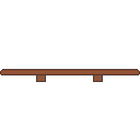
On Day 4, I woke up and prepared to continue making games. Soon, my brain goes: "Hey, let's make some jump-through wood platforms..." And so I did. It's not that bad, but it still looks good. I added the Jump-Through behavior so that players can get on top of it, but can't get down.

Soon, it is time for me to make more levels. I've made an extra 5 levels with the players to make the players think critically, whether they should risk to take or just play safe and escape. It was a fun time to do something like that, until I've realized that I might not have enough time to make more levels. I haven't made a functional game menu, a game over, credits, and finally some music and sound effects. Fortunately, I remembered there was someone who was willingly to make music and sound effects when I was joining a Mini Jam: Egypt. I asked him if he was busy and he wasn't. Therefore, I got his help in making music and sound effects, mentioned him what needs to be done, and he is on progress. Now, it's time to make a game menu.
When I'm making game menus, I really suck at it. Really, no joke. Previously, I made a menu with just these things required:
- A game title
- A play button to play the game
- A quit button to quit the game
- A background
- A thumbnail
But now, after all of my experiences, I need these:
- A game title
- A play button to play the game
- A credits button to show all of the people who are involved and to not read the descriptions about it
- A background that seems so cool and shows that the game is still running
- A quit button to quit the game
- A controls and how to play the game screen
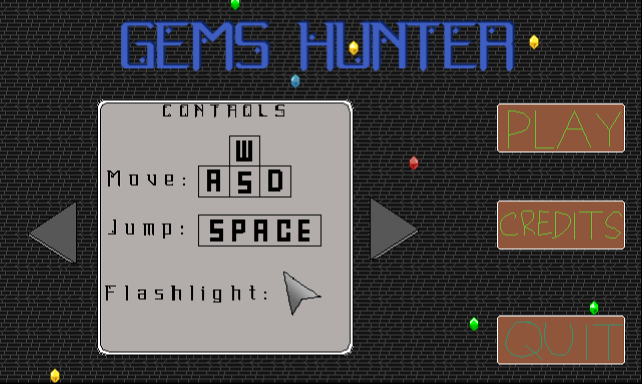
The last part of the list is something I've usually overlooked. But not this time, because I've learned from experiences and best of all, I got an inspiration. When I was taking a break, I looked up to Vimlark's games and play one of his games, Flyer Kid. I saw how he interpreted the main menu screen and brought me an idea for the game menu screen. Instead of making another scene for a controls and how to play screen, I made a box telling players on how to play the game and what are the controls. At first, it was hard. But soon, I got the hang of it. I also used the gems in the game to be spawned at a random location and going from right to left, indicating that the game is working properly. Here's how the main menu screen looks like.

In my view, I see progress and a great improvement from all of my failures. Also, when I've just screenshotting this pic, the QUIT has a different color than the PLAY and CREDITS. But I don't see anything wrong with that, right?
Gems Seeker
Find gems, collect them, get out, repeat!
| Status | Released |
| Author | TheGamer |
| Genre | Puzzle, Platformer |
| Tags | 2D, Construct 2, gems, Pixel Art, Puzzle-Platformer, Singleplayer, vimjam |
| Languages | English |
More posts
- Update: Fixed bugs + ExtraOct 03, 2020
- Day 7: Submission timeSep 25, 2020
- Day 6: Full speed ahead!Sep 24, 2020
- Day 5: Extra push on levels, a game over screen, and a credits screenSep 23, 2020
- Day 3: New levelsSep 21, 2020
- Day 1 and 2: The idea and a startSep 20, 2020
Leave a comment
Log in with itch.io to leave a comment.